

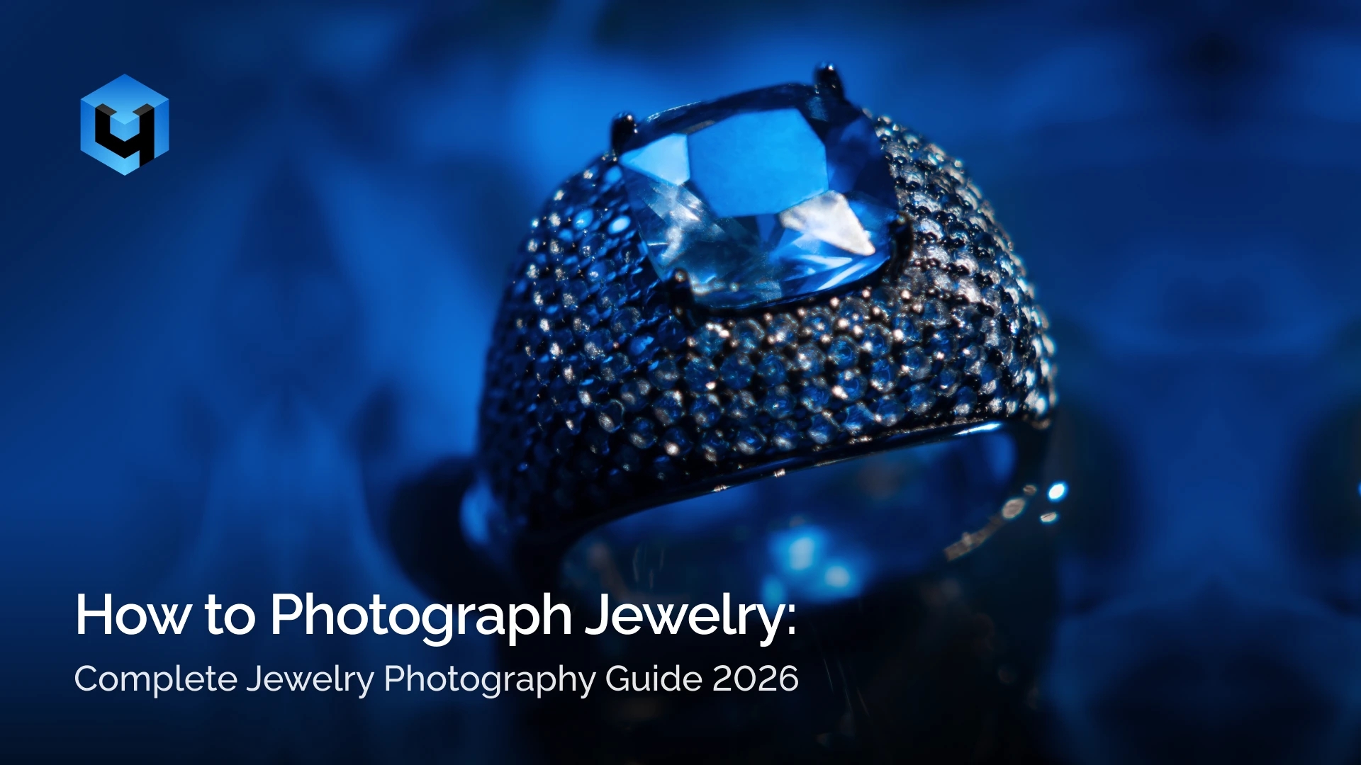
Learning how to photograph jewelry well is not just about making products look nice. It is about making them look trustworthy. Online, buyers cannot touch the piece, check the finish, or turn it under the light themselves, so the photo has to do that work.
Jewelry also gives photographers less room for error than most products. Metal picks up reflections from everything nearby. Gemstones can look brilliant in person and strangely lifeless in a photo. Even tiny bits of dust, uneven color, or soft focus become obvious once the image is viewed up close. Most jewelry shots do not fail because the setup is impossible. They fail because tiny problems look harmless until the image is enlarged.
This guide walks through the process in a practical way. It covers the gear that actually helps, how to light reflective pieces without creating a mess, which camera settings tend to work best, and how to approach different jewelry types without treating them all the same.
It also covers styling, phone photography, editing, and preparing images for platforms like Etsy, Amazon, Shopify, and Instagram. The point is not to overcomplicate the process. It is to help you create jewelry photos that look clear, polished, and believable.
By the end, you should have a much better sense of how to photograph jewellery in a way that feels professional, consistent, and ready for real use.
Why Jewelry Photography Matters
Jewelry photography matters because people judge the product before they read the description. They notice shine, shape, finish, stone detail, and color almost instantly, and that first impression tends to stick.
That is even more true with jewelry than with many other products. A mug can survive an average photo. A ring usually cannot. If the metal looks dull, the gemstone looks cloudy, or the color feels off, the piece immediately seems less valuable. Buyers may not always know what is wrong, but they can usually tell when something feels cheap.
There is also a direct business reason to care about this. Salsify reports that 61% of shoppers say product images and videos are the most important elements on a product page when deciding whether to buy, and Etsy has reported that 90% of buyers consider photo quality extremely important in purchase decisions.
Good images also shape how a brand is perceived. A store with clean, consistent product photos looks more reliable. A store with uneven lighting, mixed styles, and weak detail usually feels less polished, even if the products themselves are strong. Baymard has also found that only 48% of leading desktop sites and 38% of mobile sites have a “decent” or “good” product page UX.
For small brands, handmade sellers, and independent jewelers, strong photography is one of the clearest ways to look more established. Better photos do not just decorate the product page. They help sell the product.
Essential Equipment for Jewelry Photography
Essential equipment for jewelry product photography includes a camera or smartphone, a macro lens or macro-capable setup, a tripod, a clean background, and basic styling tools. For beginners starting with DIY jewelry photography, that is usually enough to control sharpness, reflections, and consistency without turning the setup into a full studio project.
This part gets overcomplicated quickly. A lot of people assume better gear automatically means better jewelry photos, but that is not usually the first problem. Unstable framing, weak light control, and messy reflections tend to ruin images long before camera bodies do. A more expensive camera rarely fixes a bad reflection. It usually just records the problem more clearly.
The goal is to build a setup that helps your jewellery look clear, polished, and repeatable from shot to shot.
Camera
A DSLR or mirrorless camera is the best choice when you want full control over exposure, white balance, detail, and lens options. That control matters more in jewelry photography than in many other product categories because close-up work makes small technical problems easier to spot.
That said, not everyone needs to start there. A smartphone can still work well for beginners, small sellers, and anyone producing simpler product images or social content. If the light is soft and the setup is stable, modern phones can do more than people expect. The problem is not that phones are useless. It is that they become unreliable faster once the scene gets reflective or the shot needs more precision.
Lenses
A macro lens is one of the most useful tools in jewellery product photography because it lets you capture small details, textures, engravings, stone settings, and surface finish with much more control. Popular options are 60mm, 100mm, or 105mm macro lenses.
The reason macro lenses matter is simple: jewelry gets photographed close, and ordinary lenses often do not handle that distance well enough. You can still get the shot, but not always the detail. That gap becomes obvious fast once the image is cropped or viewed full size.
If a true macro lens is outside the budget, extension tubes are a practical alternative. They let you focus closer and are often good enough for beginners who want better detail without buying another lens immediately.
Tripod
A tripod is essential for jewelry product photography because it keeps the camera steady during slower shutter speeds and makes framing easier to repeat. In close-up work, even tiny movement can soften the image, and jewelry rarely gives you enough visual forgiveness to get away with that.
A tripod also helps in a less obvious way: it slows the process down in a good sense. Once the camera stays fixed, you can adjust the jewelry, reflections, and composition without constantly rebuilding the frame.
For beginners, almost any stable tripod with adjustable height and angle can work well. Compact tabletop options are useful for small setups, while standard tripods are better when you want more control or work with a dedicated shooting table.
The important part is stability, not size. A good tripod should hold the camera firmly, allow precise composition, and stay reliable during close-up shooting where small vibrations become visible quickly.
Backgrounds
Backgrounds shape the look of the image and help keep attention on the product. For eCommerce, a white sweep background is the most common choice because it looks clean, neutral, and easy to use across marketplaces and product pages.
For styled images, black, gray, beige, or textured surfaces like stone, linen, marble, velvet, wood, or acrylic can work well. These backgrounds are more useful for branding, social content, or editorial-style photography than standard catalog images.
The best jewelry photography background depends on the purpose of the shot. White works best when clarity and consistency matter most. Textured or colored surfaces work better when the image needs mood or visual identity. What matters either way is that the background supports the jewelry instead of competing with it.
Props & Styling Tools
Props and styling tools help position jewellery neatly and make small pieces easier to photograph. They are especially useful when the product refuses to stay where you want it, which happens more often than guides usually admit.
Common tools include dental wax or museum wax to hold rings and pendants in place, fishing line to suspend earrings, and mannequin busts or stands for necklaces. Tweezers, tape, clips, and foam blocks also help with small adjustments that would be awkward to make by hand once the setup is arranged.
For styling, simple props like trays, fabric, ribbon, stone, or dried flowers can add context without taking attention away from the product. The mistake is usually not using props at all. It is using too many. Jewelry already brings its own visual detail, so most styled shots need less help than people think.
Lighting for Jewelry Photography
Many beginners search for jewelry photography without reflection, but that idea causes trouble fast. Jewelry is supposed to reflect. The problem is not reflection itself. The problem is ugly reflection—hard glare, bright hotspots, messy room shapes, and flat metal that stops looking expensive. If the jewelry suddenly looks cheap in the photo, the cause is usually the reflection, not the piece itself. Good jewelry photography lighting cleans it up.
This is where jewelry becomes difficult in a very specific way. A product like paper, fabric, or matte ceramic gives you some forgiveness. Jewelry does not. Metal catches everything around it. Stones react differently depending on cut, color, and transparency. Tiny changes in angle can completely change the shot, which is why lighting mistakes here look bigger than they really are.
Soft, diffused light is usually the best place to start because it gives the product smoother highlights and fewer harsh transitions. Hard light can work for dramatic editorial images, but for standard product work it usually creates more problems than it solves. Most pieces do not need stronger light. They need cleaner light.
Because jewelry is highly reflective, the goal is not just brightness but control. A good setup helps the piece look polished, dimensional, and believable. A bad setup makes even beautiful jewelry look cheap.
Natural Light Setup
Natural light is a good starting point for beginners because it is accessible, simple, and often flattering when handled carefully. The easiest setup is near a large window with indirect daylight, using a sheer curtain, tracing paper, or another diffuser to soften the light before it hits the piece.
Direct sunlight is usually too aggressive for jewelry. It creates bright glare, hard-edged shadows, and blown highlights that hide detail instead of showing it. At first it can look dramatic, but that usually fades once you notice the metal clipping and the stone going dull. Soft window light works better because it spreads more evenly across the jewelry and gives you more control. Beginners often mistake brighter light for better light. With jewelry, that usually makes the image harder to control, not easier.
To improve a natural-light setup, place white foam boards or cards around the piece to bounce light back into darker areas. This helps reduce heavy contrast and keeps the jewelry from looking too dark on one side. It also gives the metal cleaner things to reflect, which matters more than most beginners expect.
Natural light can produce beautiful results, but it is less predictable. Clouds shift, daylight changes, and matching one shot to the next becomes harder. That is the trade-off. It is easy to start with, but harder to repeat exactly.
Artificial Light
Artificial light is the better choice when consistency matters. Softboxes, LED panels, and diffused continuous lights are useful because they let you repeat the same setup at any time of day instead of chasing whatever the window gives you.
The important part is not using a stronger light. It is using a larger, softer light source. Bare bulbs and direct flash usually create harsh reflections on metal, glass, and polished stones. A diffused light source gives smoother highlights and makes the jewelry look more refined.
Artificial light is especially useful for product catalogs, batch shooting, and any workflow where multiple products need to match. That consistency is hard to get with daylight alone. One of the most frustrating parts of jewelry photography is getting the first image right, then failing to recreate it later because the light changed.
A simple artificial setup often works well when you combine one main diffused light, a few white bounce cards, and careful product positioning. In many cases, the light itself is fine. The angle is what needs fixing.
Light Cone / DIY Light Tent
A light cone or DIY light tent helps reduce unwanted reflections by surrounding the jewelry with soft white material. Instead of reflecting the room, the camera, or your hands, the piece reflects a cleaner and more controlled environment.
This is especially helpful for polished metals, watches, glossy stones, and glass surfaces. Even a basic homemade light tent made from a box and white diffusion material can improve the image noticeably.
Still, light tents are easy to overuse. When everything becomes too soft and too even, the jewelry can lose shape. Metal needs some contrast to look like metal. If the image starts looking flat, small black or white cards placed outside the frame can help shape the reflections and bring back definition. Clean is good. Flat is not. A light tent solves reflection problems quickly, but it can also erase the contrast that makes metal look expensive.
Lighting for Different Metals
Different metals respond differently to the same setup, so one lighting approach does not always work across the whole product line.
Gold usually looks best under soft neutral light that keeps its warmth without making it go orange. If the light is too cool, gold can look pale or slightly green. If it is too warm, it starts to feel heavy and less refined. The best gold photos usually show warmth with restraint.
Silver is often the hardest metal to light because it reflects everything around it. It behaves almost like a mirror, so clutter, colored walls, dark clothing, or the camera itself can appear in the shot. Silver usually needs the cleanest surroundings, the softest diffusion, and the most careful placement. Most silver problems are reflection problems, not exposure problems. That is why silver can look wrong even when the histogram looks fine.
Rose gold needs especially careful white balance. It can shift too pink, too copper, or too orange very quickly if the setup is mixed or inaccurate. A neutral base usually works best, followed by small corrections later if needed.
Platinum often looks cooler and more understated than gold, but it still needs controlled highlights to show form and finish. Slightly firmer contrast can help define the edges and keep the metal from feeling dull.
In practice, metal usually looks better when the reflections are cleaner, not brighter. That is the adjustment that matters most.
Lighting for Gemstones
Gemstones need a different lighting approach because the goal is not only to control reflections, but also to show color, depth, cut, and sparkle at the same time. That is where many images fall apart. The stone is technically visible, but it does not feel alive. That is one of the most frustrating parts of gemstone work: the file looks correct, but the stone still looks dead.
Soft light is still the base, but gemstones usually need more than soft light alone. If the light is too flat, the stone may look clean but lifeless. If it is too harsh, highlights clip too fast and the surface starts to look crude instead of brilliant.
Diamonds are especially sensitive to this balance. Too little directional light and they look dull. Too much and the bright areas blow out, hiding the cut. Colored stones create a different problem. They need enough light to show energy, but not so much that the color starts to wash out.
Transparent stones often respond well to a bit of side light or slight backlight because it helps reveal depth and internal structure. Darker or more opaque stones may need a more careful front-light setup so they do not go muddy. In both cases, tiny angle changes matter more than big lighting changes. Sometimes a slight turn of the ring does more than moving the whole light.
Cleanliness matters even more with gemstones. Dust, fingerprints, and tiny smudges become very visible once the stone catches the light. Before changing the setup, it is often worth checking the piece again.
The final result usually comes from small movements, not dramatic adjustments. That is the part beginners often underestimate. Gemstone lighting is less about force and more about precision.
Camera Settings for Jewelry Photos
Jewellery product photography usually rewards careful settings more than clever ones. You are not trying to create dramatic blur or chase motion. You are trying to get clean detail, accurate color, and enough depth of field to make the product look properly finished.
Aperture
A smaller aperture is usually the right call. Since jewelry is photographed close up, depth of field becomes shallow very quickly. If the setting is too wide, one part of the piece may look sharp while the rest falls away too fast. For most product images, f/8 to f/16 is a practical range because it keeps more of the jewelry in focus. Aperture is usually where beginners get overconfident. One edge looks sharp, so the whole piece seems sharp — until you check the image properly.
ISO
ISO should stay low whenever possible. Jewelry images do not benefit from noise, and close-up crops make even slight noise more noticeable. ISO 100 or 200 is usually enough when the camera is on a tripod. Raising ISO often solves exposure in the quickest way, but it usually hurts image quality in the process.
Shutter Speed
Shutter speed matters less because the subject does not move. That is one of the few advantages here. As long as the setup is stable, slower shutter speeds are fine. A tripod, timer, or remote release makes this much easier, especially when working with macro detail.
White Balance
White balance deserves more attention than it usually gets. Buyers notice color errors fast in jewelry. Gold that looks slightly green, silver that looks too warm, or gemstones that shift tone can make the whole image feel unreliable. A custom white balance or neutral reference is often worth the extra step.
Focus Stacking
For close macro work, one frame may still not be enough to keep the whole piece sharp. That is where focus stacking becomes useful. It takes more time, but when done well, it produces a cleaner final image than forcing one shot to do all the work.
How to Photograph Different Types of Jewelry
Different types of jewellery need different shooting techniques because their shape, scale, finish, and structure affect how they should be positioned, lit, and retouched. A setup that works for a ring may fall apart with a necklace, and a lighting arrangement that looks great on brushed metal may completely flatten a faceted gemstone.
This is where many jewelry photo guides become too generic. They explain lighting once, mention camera settings once, and then assume every product behaves the same. It does not. Small differences in shape and material change almost everything. Rings need controlled depth and a strong focal point. Earrings need symmetry. Necklaces demand patience in styling. Watches punish sloppy reflections. Gemstones only look convincing when the light and angle work together.
The practical approach is simple: adapt the setup to the piece instead of forcing every product into the same formula. That gives you images that look cleaner, more intentional, and more useful for both eCommerce and social content.
Rings
Rings are small, reflective, and usually designed around one main point of interest, such as a center stone, a setting, an engraved face, or a distinctive band shape. That makes them one of the most detail-sensitive jewelry subjects. If the focus lands slightly wrong or the angle hides the structure, the whole piece feels weaker. Rings are especially unforgiving because being almost right still looks wrong.
Learning how to photograph rings well starts with careful positioning. A ring should look stable, balanced, and easy to read. Upright placement often works best because it shows the band shape and gives the design more presence. Dental wax or museum wax is useful here because it can hold the ring in place without obvious support. A flat lay can also work, especially for cleaner catalog shots, but it tends to flatten the shape unless the band or top detail is very strong.
A good ring photo set usually includes a few dependable angles:
- A straight-on hero shot to show the full design clearly
- A slight 45-degree angle to reveal thickness and setting depth
- A macro crop of the stone, engraving, prongs, or texture
These angles do different jobs. The hero shot is for quick recognition. The angled shot adds dimension. The close-up proves quality. Buyers often respond best when all three are present, because one image alone rarely explains the whole ring.
Lighting matters just as much as placement. A ring can look polished in person and strangely dead in a photo if the light is too flat. Front light alone often removes too much shape. A slightly shifted light source or a small reflector can help the stone catch light more naturally while keeping the metal under control. Soft, diffused light remains the base, but rings usually need a bit of shape in the reflections to avoid looking dull.
Focus is another issue. Because you are shooting close, depth of field becomes limited very quickly. If the front prongs are sharp but the back of the band disappears, the image can feel accidental rather than professional. Stopping down the aperture helps, and for close macro shots, focus stacking is often the cleanest solution.
Retouching for rings usually involves dust cleanup, smoothing uneven reflections, removing fingerprints, and correcting tiny scratches. Rings are unforgiving. Even clean pieces often show marks once zoomed in. The best workflow is still to prepare the piece carefully before shooting, because editing every ring heavily slows the whole process.
Save hours on retouching with AI, remove dust and polish ring photos faster with Retouch4me Dust.
Earrings
Earrings need neat alignment and clean presentation because even a small mismatch between the left and right side becomes obvious in the final image. With other jewelry, a slight imperfection can pass. With earrings, it usually looks like a mistake.
The first thing to decide is whether you are photographing the pair together, one earring as a detail shot, or both. For catalog work, paired images are usually essential because buyers want to see symmetry and overall design. A single-earring close-up is useful when the texture, stone setting, or craftsmanship deserves extra attention.
Positioning depends on the type of earring:
- Hooked-back or drop earrings, where length and hanging shape matter
- Stud earrings, where the front face and alignment matter most
Fishing line is especially useful for drop earrings because it lets them hang naturally without a bulky support. It also helps preserve a sense of lightness, which is important for delicate designs. Stud earrings are easier to manage, but they can still be tricky if their fronts tilt inconsistently or reflect light unevenly.
Composition matters more than many people expect. The spacing between the earrings should feel deliberate, not approximate. They can be shown side by side for a clean product look, or angled slightly inward for a softer composition. The key is consistency. Most earring photos fail before lighting becomes the issue—they fail because one side sits a little higher, turns slightly more, or catches a different reflection. Viewers may not name the problem, but they notice the imbalance immediately.
Lighting should stay soft, but not empty. Small earrings can disappear when the light is too even, especially if the design is thin or highly polished. A little shadow shaping or a black card near the edges can help define the outline. With drop earrings, it is also important to watch the shadows below the piece so they do not compete with the product.
For retouching, the priorities are usually symmetry, support removal, edge cleanup, and metal correction. If fishing line or wax is visible, it needs to disappear cleanly. If one earring looks slightly different in brightness or angle, balance them. Buyers notice that kind of mismatch immediately, even when they cannot explain why.
Save hours on retouching with AI, clean background imperfections and fine details with Retouch4me Clean Backdrop.
Necklaces & Chains
Necklaces and chains are harder to style than they first appear because they twist, shift, lose symmetry, and rarely stay where you place them for long. A necklace can look perfect to the eye and still look uneven in the frame. This is why necklace photography often takes longer than people expect. The product is fighting gravity and tiny shifts. This is one of the most time-consuming jewelry categories because it demands patience.
There are three common ways to photograph necklaces:
- On a mannequin bust for shape and wearability
- On a cardboard clipboard or backing board for control and symmetry
- Laid out on a flat surface for a clean product image
Each approach has a different purpose. A mannequin bust helps show how the necklace drapes and where a pendant sits on the chest. That makes it useful for buyers who care about fit and scale. A backing board offers more control and is often the easiest way to keep the chain balanced. Flat lay images work well for minimal eCommerce presentation, especially when the necklace design is simple and the main goal is clarity.
Flat setups require the most styling attention. Pendants should sit straight. Both sides of the chain should feel balanced unless asymmetry is intentional. Curves should look smooth rather than stiff. Small chain shifts are very noticeable, particularly with thin necklaces where every bend catches light differently.
Lighting should separate the chain from the background without creating harsh hotspots. Thin chains often blend into the surface when the light is too soft and too even. This is one of the few cases where a little extra edge definition helps a lot. The necklace should remain soft and polished, but still readable.
Buyers also benefit from seeing more than one shot here. A full design image shows the complete necklace, but a tighter crop can highlight the pendant, chain texture, clasp, or stone detail. That extra detail matters when the necklace includes craftsmanship that might disappear in a wider shot.
Retouching usually involves cleaning dust, correcting twists, refining spacing, straightening pendants, and evening out the background. The cleaner the chain arrangement is before shooting, the less frustrating the editing becomes later.
Save hours on retouching with AI, speed up chain and background cleanup with Retouch4me Clean Backdrop.
Bracelets & Bangles
Bracelets and bangles can be photographed as clean product shots or in more wearable, lifestyle-focused ways, depending on what you want to emphasize. The challenge is showing shape, scale, and fit without making the piece feel stiff or visually confusing.
A useful shot sequence often includes:
- One flat product shot for clarity
- One angled shot to show depth
- One on-wrist image to show scale or flexibility
That combination works because each image answers a different question. The flat shot shows the overall design. The angled version adds shape. The on-wrist image explains how it feels when worn. For charm bracelets, chain bracelets, and flexible pieces, a worn image is often especially helpful because flat shots do not always communicate movement well.
Flexible pieces should curve naturally. Forced styling tends to make them look rigid or artificial. Bangles and cuffs usually benefit from a slight angle because it helps show the inner and outer form, which can otherwise disappear in a straight-on view.
Lighting should define both the structure and the finish. Bangles can lose their shape under very flat light, while chain bracelets may lose separation between links if the image lacks edge contrast. Soft light is still the base, but controlled shadows give the bracelet more form.
It is also worth thinking about feature shots here. If a bracelet has a distinctive clasp, engraved plate, charm cluster, or gemstone section, a tighter crop adds value. Customers often need to see the details that make one bracelet feel different from another.
Retouching usually includes clasp alignment, dust cleanup, balancing highlights, and correcting tiny spacing issues between links or charms. For on-skin photos, some light skin cleanup may help, but it should stay secondary. The bracelet remains the subject.
Save hours on retouching with AI, remove dust and small surface distractions with Retouch4me Dust.
Watches
Watches are one of the most technical jewelry subjects because they combine polished metal, crystal, depth, tiny text, and multiple reflective surfaces in one piece. They look precise in real life, and that precision has to come through in the image. A watch photo that is slightly careless feels much worse than a ring photo that is slightly imperfect.
The biggest challenge is usually controlling reflections on the crystal while keeping the dial visible. You need enough highlight to make the case and crystal feel premium, but not so much that the face becomes unreadable.
A classic setup starts with the hands positioned at 10:10. That arrangement looks balanced, avoids covering key elements, and frames the center of the dial nicely. From there, it helps to photograph at least three useful angles:
- A front-facing hero shot of the dial
- A three-quarter angle showing case depth
- A detail shot of the crown, strap, bezel, or side profile
These views work well because watches are built around both face detail and physical construction. The dial matters, but so do thickness, finish, case shape, and strap texture.
Lighting needs more control than with most jewelry. The watch crystal easily reflects the camera, room, and light source. A light tent or large diffusion panel is often the safest starting point. Then you refine with tiny angle changes. With watches, small movements do the real work. A shift of a few degrees can clean up the crystal completely or ruin the shot. Watch photography often feels slow for this reason: the setup can be correct, and the angle can still be wrong.
The dial must stay readable. If reflections cover the hands, markers, or brand area, the image loses much of its purpose. At the same time, the metal should not look flat. Controlled highlights on the case and bracelet help the watch feel substantial and well-made.
Watches also reward more detail shots than other jewelry types. Close-ups of the crown, lugs, bezel markings, pushers, clasp, or strap stitching can make the product feel more premium and better explained.
Retouching is usually more demanding here. Common fixes include crystal reflection cleanup, dust removal on the bezel or dial, metal polishing, strap correction, and contrast balancing. Watch images also require restraint. Over-sharpening makes the dial and edges look harsh very quickly.
Save hours on retouching with AI, automate watch photo cleanup with Retouch4me Apex.
Gemstones & Diamonds
Gemstones and diamonds require a different approach from metal-focused jewelry because the goal is not only to control reflections, but also to reveal brilliance, depth, cut, and color. A gemstone can look lively in person and disappoint badly in a photo if the angle or light is even slightly wrong.
This is the category where small changes matter the most. Rotate the piece a little, raise one side slightly, or move the camera a fraction, and the stone may suddenly come alive. This is one of the few product categories where a tiny angle adjustment can matter more than changing the light itself. Leave everything static and over-rely on soft light, and the image may stay technically clean but visually flat.
A practical setup is usually built from three parts:
- Soft diffused main light for overall shape
- Small controlled side or back light for sparkle
- Careful angle adjustment to bring the stone alive
Each part has a role. The main light keeps the image clean. The directional light creates flashes of brilliance. The angle determines whether the stone actually responds well.
Diamonds need balance more than force. Too little directional light and they look dull. Too much harsh light and the brightest parts clip, which removes detail and makes the sparkle look fake. The best diamond photos usually have controlled brilliance rather than explosive glare.
Colored gemstones add another challenge: saturation. If exposure runs too bright, the stone may lose richness. If the setup is too dark or too flat, it can lose presence. Transparent stones often benefit from a little side light or backlight to show depth, while darker stones may need careful front light to avoid looking muddy.
Customers also benefit from understanding that gemstone shots often need multiple attempts. Unlike some jewelry types, a stone may not reveal its best look from the first setup. You often need to test a few positions and small angle changes until the cut starts working with the light.
Cleanliness matters even more here. Dust, fingerprints, and tiny smudges become very obvious once the stone catches highlights. Before adjusting anything else, check the surface again.
Retouching for gemstones usually focuses on dust removal, highlight control, color correction, and micro-contrast. The biggest mistake is over-editing the sparkle until it looks artificial. Real brilliance is more convincing than exaggerated glow, and people usually trust that look more.
Save hours on retouching with AI, clean tiny dust spots and speed up detail work with Retouch4me Dust.
Jewelry Photography Ideas & Styling
Jewelry photography ideas and styling help shape how the product is perceived, not just how it is seen. The same ring can look clean, expensive, delicate, modern, or forgettable depending on the way it is styled. That is why styling matters, even when the product itself is strong.
At the same time, this is one of the easiest sections to overdo. Many jewelry photos stop being useful the moment the styling becomes more interesting than the piece. A good setup adds context, mood, or polish. A bad one turns the jewelry into a prop inside its own image.
A practical approach is to combine clean eCommerce shots with a smaller number of styled images for branding, social media, or campaign use. That usually gives the best balance: enough clarity to sell the piece, enough variation to keep the visuals from feeling flat.
Clean Ecommerce Style
Clean eCommerce styling focuses on clarity, consistency, and restraint. A white or neutral background, soft light, and a simple composition help keep the jewelry easy to read and suitable for product pages, marketplaces, and catalogs.
This style works best when the product needs to do the talking on its own. It is especially effective for collections, online stores, and any product range where consistency matters more than atmosphere. There is not much room to hide in this format, which is exactly why it works. If the jewelry is lit well, styled neatly, and shown clearly, the image feels trustworthy. Clean product photography looks simple only when all the small decisions were handled properly.
Minimal styling still needs discipline. A ring placed slightly off, a chain with awkward curves, or earrings that do not sit evenly can make a supposedly clean image look careless. Simple setups are often less forgiving than styled ones.
Lifestyle / On-Model
Lifestyle or on-model photos show how the jewelry looks when worn, which gives the piece context that studio product shots cannot always provide. A necklace on the neck, a ring on a hand, or earrings in motion can make the product feel more real and easier to imagine in daily use.
This approach works especially well for social media, campaigns, and branded content because it adds mood without needing heavy props or complicated sets. It also helps solve one practical problem: scale. Jewelry often looks larger in isolated product photos than it really is, and showing it on a person clears that up quickly.
The risk here is distraction. If the pose, styling, makeup, or wardrobe starts demanding too much attention, the jewelry loses ground fast. Good on-model photos still keep the piece readable.
Flat Lay Compositions
Flat lay compositions are a simple way to build more styled jewelry photos using surfaces, spacing, and a few controlled props. Backgrounds like stone, fabric, paper, wood, or marble can shift the mood without changing the jewelry itself.
This style is useful when you want something more branded than a plain product shot, but still more controlled than a full editorial setup. Flat lays work well for social posts, gift guides, seasonal collections, and small campaigns where visual variety matters.
The main mistake is overfilling the frame. Jewelry product photography already carries detail, shine, and texture, so it usually needs less support than people think. A tray, ribbon, dried flower, or fabric fold can help. Five of them usually do not.
Creative / Editorial Styling
Creative or editorial styling gives you more freedom to experiment with atmosphere, contrast, and visual identity. This can include stronger shadows, reflective surfaces, colored backgrounds, unusual crops, or tighter, mood-driven compositions that make the jewelry feel more expressive.
These images are less about pure product clarity and more about impression. They are useful for lookbooks, launch campaigns, social-first content, and branding work where the goal is not just to show the piece, but to make it feel distinct.
That said, editorial styling works best when it still suits the jewelry. Not every product benefits from drama. Some pieces need clean restraint, not theatrical lighting. When the styling idea is stronger than the product itself, the image may look clever but still fail.
Scale Shots
Scale shots help show the actual size of the jewelry, which is often difficult to judge in close-up product images. This is especially useful for small, delicate, or minimal pieces that can look much larger in isolated photos than they do in real life.
Showing a ring on a finger, earrings on an ear, or a pendant on the neck makes proportions easier to understand and removes some of the guesswork. That alone can make the image set more useful.
Scale shots are practical more than dramatic, but they matter. Buyers often hesitate over size before anything else, and a clear scale image answers that question faster than a paragraph ever will.
How to Photograph Jewelry with Your Phone
You can photograph jewelry with phone if it has a decent camera, close-up capability, and settings that let you control focus and exposure. For beginners, that is often enough to produce clean results, especially for smaller shops, marketplaces, and social media content.
Phone photography works best when expectations stay realistic. It is convenient, fast, and much more capable than it used to be, but it still depends heavily on light, stability, and distance. Most bad phone jewelry photos are not really caused by the phone itself. They usually come from the same three things: unstable framing, harsh light, and reflections nobody noticed while shooting.
A strong phone setup also needs the right habits. A phone tripod, AE/AF Lock, soft light, and careful editing usually matter more than chasing the newest model.
What Phones Work Best
Phones with macro mode are useful for photographing small details like gemstones, engravings, and fine metal texture. Phones with Pro mode are also helpful because they give you more control over exposure, white balance, and focus, which makes the results more predictable.
If your phone does not have a dedicated macro mode, it can still work well for jewelry product photography as long as the lighting is good and the shot is stable. The main thing to watch is focus distance. Phones often struggle when they are pushed too close, and that is where beginners start fighting the device instead of using it properly.
What matters most is clear focus, controlled processing, and enough detail to make the piece look accurate rather than over-smoothed.
(image)
Use a Phone Tripod and Camera Controls
A tripod for your phone helps keep the image sharp and makes composition much easier to repeat. That is especially important in jewellery product photography, where small movements can reduce detail or shift reflections enough to change the shot.
Useful phone camera features include AE/AF Lock, which locks exposure and focus so the image does not keep changing while you shoot. That single step solves a lot of frustration. Without it, the phone may keep adjusting every time you move slightly, and the result becomes inconsistent fast.
Portrait mode can work for lifestyle shots, but it is less reliable for standard product photos. Chains, prongs, and fine edges often confuse artificial blur, and once that happens the image starts to look processed instead of clean.
Make a DIY Lightbox
A simple lightbox made from a box and white paper is one of the easiest ways to improve DIY jewelry photography at home. It softens the light, reduces harsh reflections, and gives the jewelry a cleaner environment to reflect.
This setup works especially well for rings, earrings, and other shiny pieces that tend to pick up distracting reflections from the room. It also helps reduce the visibility of your phone or hands in polished metal, which is one of the most common problems in phone-based jewelry photography.
A DIY lightbox does not need to be elaborate. What matters is that the light becomes softer and the surroundings become cleaner.
Avoid Common Mistakes
The most common phone photography mistakes are digital zoom, flash, and visible reflections of the phone or hands in the jewelry. Digital zoom lowers image quality quickly, and built-in flash usually creates harsh glare that makes jewelry look cheaper, not sharper.
It is better to move the phone physically closer, use softer light, and check the product carefully for reflections before taking the shot. Small angle changes often fix problems that people first try to solve with editing.
Another common issue is letting the phone overprocess the image. Strong automatic sharpening, excessive HDR, or heavy contrast can make metal look unnatural. Clean and believable is usually better than dramatic.
Edit on Mobile
Mobile editing apps can help clean up the final image and improve consistency. Snapseed and Lightroom Mobile are useful for correcting exposure, white balance, contrast, crop, and small distractions without needing a desktop workflow.
The editing should stay controlled. Jewellery needs to look polished, but it should still look real in color, texture, and shine. Most phone shots improve from a few careful adjustments, not heavy effects.
Jewelry Photo Editing and Retouching
Jewelry photo editing and jewelry photo retouching help turn a solid shot into a clean, polished image that looks professional and ready for eCommerce or social media. Even when the lighting is good, jewelry photos often still show dust, fingerprints, uneven reflections, or small color shifts that need correction.
Good retouching improves clarity and presentation without changing the real look of the piece. If the image only starts looking good after heavy retouching, the shooting setup was probably doing too little. The aim is to make jewellery product photography feel cleaner and more premium, not artificial.
Start with a Basic Editing Workflow
Start with the basics first: exposure, white balance, contrast, and crop. These adjustments help the image look balanced, consistent, and ready for more detailed cleanup.
Exposure should brighten the jewelry without blowing out highlights. White balance matters because metals can shift easily. Gold can become too orange or green, silver can look too warm, and rose gold can lose its natural tone. Contrast helps define the shape, while cropping improves composition and keeps product images consistent across a set.
Remove Dust, Spots, and Fingerprints
Even after careful cleaning, jewelry photos usually reveal small distractions once viewed up close. Dust, smudges, fingerprints, and tiny spots are some of the most common issues.
These should be cleaned up early in the editing process. They may seem minor, but in close-up product photography they quickly make the image look less polished. Dust is one of those problems that feels small until it appears on a polished surface at full size.
Polish Metal in Photoshop
Metal usually needs more careful retouching than most other surfaces because it reflects light unevenly and easily shows scratches, dull patches, or messy highlights. In Photoshop, this is often handled with dodge and burn, Clone Stamp, and healing tools.
Dodge and burn helps smooth transitions in highlights and shadows. Clone Stamp and healing tools are useful for cleaning scratches, spots, and rough reflections. The result should still look like real metal. Over-polished metal often starts to look fake.
Adjust Color for Different Metals
Different metals usually need slightly different color treatment in post. Gold needs warmth, but too much makes it look heavy or orange. Silver should stay neutral and clean. Rose gold needs balance so it does not turn too pink or too copper.
This is where subtle color correction helps. Small adjustments to white balance, tint, and selective color can improve the image without changing the material into something it is not.
Accurate color matters even more in online selling, where buyers rely on product photos to judge metal tone and finish. Want to improve consistency across product images? Read our guide to ecommerce Color Correction and Grading.
Remove or Clean the Background
Background cleanup is especially important for eCommerce images. Many product pages work best with a clean white background because it keeps attention on the jewelry and makes the store look more consistent.
If the background is meant to be pure white, it should look even and clean without rough edges around chains, stones, or delicate parts. For styled shots, the goal is usually not full removal but a cleaner, less distracting background.
Use AI Retouching to Speed Up the Workflow
AI retouching can make jewellery photo editing much faster by automating repetitive cleanup tasks and improving consistency across a batch of images. This is especially useful for product photography, where you often need to correct the same issues again and again, such as dust, uneven tone, or background cleanup.
One example is Retouch4me, an AI retouching ecosystem designed to automate photo editing workflows, including eCommerce and product image processing. For jewelry photography, it can handle much of the routine cleanup automatically, which means you can spend less time on repetitive corrections and focus only on final refinements like tricky reflections, delicate edges, or small product-specific details.
Automate workflow and finish retouching faster.
👉 Explore AI Retouching
Before/After Example 1: Ring
The before image may show dust, fingerprints, uneven reflections, or slightly dull metal.
The after image should look cleaner, brighter, and more polished while still staying realistic.
Before/After Example 2: Necklace
In the before version, the metal may look flat, the pendant less lively, or the background slightly uneven.
In the after version, the tones feel more balanced, the highlights are cleaner, and the necklace stands out more clearly.
Before/After Example 3: Watch or Gemstone Detail
The before image may include color shifts, distracting reflections, visible marks, or weak separation from the background.
The after image should keep the piece natural while giving it cleaner color, better polish, and stronger visual focus.
Common Retouching Mistakes
Even a well-shot jewelry photo can lose quality during editing if the retouching goes too far. The most common mistakes are over-sharpening, unnatural shine, and loss of texture.
Good jewelry retouching should clean up the image without making the product look fake or less trustworthy.
Over-Sharpening
Too much sharpening can make metal edges look harsh and gemstones appear brittle or overly crisp. Instead of improving clarity, it often gives the image a rough, artificial look.
This becomes very obvious in close-up jewelry photos, where details are already prominent. Sharpening should support real detail, not exaggerate it.
Unnatural Shine
Pushing highlights, glow, or contrast too far can make jewelry look fake, plastic, or overly polished. Shine matters in jewellery product photography, but it still has to match the material and original light.
Controlled highlights almost always look better than extreme brightness.
Loss of Texture
Too much smoothing or aggressive cleanup can remove the natural surface detail that makes jewelry look real. Fine texture in metal and stones helps communicate quality and material.
When that texture disappears, the product starts to feel flat or computer-generated. Strong retouching keeps the image clean while preserving the detail that gives the piece character.
Retouching mistakes also vary across genres. In jewellery product photography, the biggest risks are over-sharpening, unnatural shine, and loss of texture, while portrait retouching focuses more on skin, tone, and facial detail. Want to compare the two? Read our guide to retouching portraits.
Platform Requirements for Product Photography Jewelry
Jewelry photos should be prepared differently for Etsy, Amazon, Shopify, and Instagram because each platform rewards a different kind of image discipline. Sometimes the difference is technical. Sometimes it is visual. Either way, the same export does not always work everywhere, even when the photo itself is good.
That is where people slip. They spend time getting the jewelry photographed properly, then treat every platform as if it displays images the same way. It does not. A clean product image that works well on Amazon can feel stiff on Instagram. A styled Etsy image can look weak if it is used where a stricter main photo is expected.
The safest approach is to start with high-resolution, well-lit source images, then adapt them for the platform instead of forcing one version to do every job. That usually means thinking about background, crop, image size, and how quickly the product reads when someone sees it in a grid, feed, or search result.
Etsy
For Etsy, listing photos should feel clear, attractive, and consistent without looking sterile. Buyers there are often comparing handmade or small-brand products, so the image set needs to show the item cleanly while still feeling human enough to fit the platform.
A white or neutral background usually works well for the main listing image because it keeps the jewelry readable and helps it stand out in search results. After that, a little variety helps. Etsy listings tend to benefit from a mix of clean product shots, close-up detail images, and a few photos that show scale, wear, or styling.
Etsy is more forgiving than Amazon, but that does not mean messy works. The strongest listings usually feel coherent from image to image. Same product, same visual logic, no random jumps in color, crop, or mood.
Amazon
Amazon is stricter, especially with the main product image, and jewelry listings do not get much room to improvise. The first image needs to be clean, direct, and compliant. Pure white background, no extra props, no decorative styling, no visual distractions.
That sounds limiting, but it also makes the job clearer. The main image is there to identify the product fast and show it accurately. It is not there to be clever. If the piece reads clearly, looks clean, and fills the frame properly, it is doing what Amazon needs.
Additional images can handle the nuance. That is where scale, detail, clasps, stone cuts, packaging, or on-model shots can help. But the first image has to stay disciplined. Many jewelry photos fail on Amazon not because they are bad, but because they are trying to behave like social content.
Shopify
Shopify gives more visual freedom, which is useful, but it also puts more pressure on consistency. There is usually no strict single-platform style forcing the images into shape, so the brand has to do that work instead.
That means the product photos should feel connected across the whole store. Similar lighting, similar crops, similar background logic, and a clear sense of what counts as a main image versus a secondary image. When that consistency is missing, even a good product can feel less premium than it should.
Shopify also allows you to think beyond compliance and more about store experience. A clean main product photo still matters, but so does how the whole collection page looks when multiple items sit next to each other. Jewelry stores often feel stronger when the images behave like a set, not individual experiments.
Instagram is less about technical restrictions and more about visual behavior on a phone screen. The image has to read quickly, hold attention, and still make sense at a smaller size. That changes what works.
Square images can still work well for orderly grids and clean product presentation, but vertical images usually create more presence in the feed. For jewelry, that often matters because small pieces can disappear fast if the composition is too wide or too quiet.
Instagram also gives more room for mood. Clean product shots still matter, but they rarely carry the whole account on their own. Lifestyle images, hand shots, detail crops, and more styled visuals usually perform better there because they give the jewelry some context and energy.
The main thing is not to upload marketplace-style images and expect them to do social work. Instagram rewards images that still feel intentional on a phone, not just technically correct on a product page.
Common Jewelry Photography Mistakes
Most jewelry photography mistakes are not dramatic. They are small decisions that quietly lower the quality of the image. The problem is that jewelry makes those mistakes very easy to see. With our jewelry photography tips, you’ll quickly learn how to avoid these mistakes.
Using Built-In Flash
Built-in flash is one of the most common issues. It creates harsh glare, blown highlights, and ugly reflections that make metal look rough instead of refined. Soft, diffused light almost always produces a better result. Built-in flash often makes jewelry look harsher, cheaper, and less detailed all at once.
Photographing Dirty or Dusty Jewelry
Dirty jewelry is another major one. A piece may look clean to the eye, then look covered in dust and fingerprints once photographed close up. This happens all the time. A quick check before shooting saves much more time than cleaning every image later.
Incorrect White Balance
Wrong white balance can also ruin a useful image. If the metal color shifts too far, the product starts to feel inaccurate. Jewelry buyers are paying attention to finish and color, so this matters more than people think. Even when buyers cannot explain the color problem, they often read it as lower quality.
Inconsistent Backgrounds and Style
Inconsistent backgrounds and styling can weaken an entire product range. Even when individual photos are acceptable, the store or catalog feels less polished if every image looks like it belongs to a different brand.
Shooting from Too Far Away
Shooting from too far away is another common mistake. Jewelry is small, and distant shots often fail to show the details that make the piece interesting. A good image set usually needs both a full product view and tighter crops.
Leaving Reflections of the Phone or Photographer
Then there are reflections. Phones, cameras, hands, and nearby objects often show up in polished metal and watch crystals. Most of the time, this is not solved by adding more light. It is solved by cleaning the environment, diffusing the light, and changing the angle.
Key Takeaways
- Great jewellery product photography is not just about getting a sharp picture of the item. It is about making the piece look clear, believable, and worth attention without turning the process into something more complicated than it needs to be.
- Jewelry is difficult because it reacts to everything around it. Light, reflections, dust, angle, color, and even small styling decisions show up quickly. That is why the basics matter so much here. A stable setup, softer light, and a cleaner environment usually improve the result more than extra gear.
- Lighting is the part that changes the image most. Soft, controlled light helps metal look cleaner and stones look more convincing. When the light is messy, the product usually looks messy too, no matter how expensive the piece is.
- Different jewelry types need different handling. Rings, earrings, necklaces, bracelets, watches, and gemstones do not respond the same way to angle, styling, or reflections. Trying to photograph all of them with one rigid method usually leads to average results.
- Editing matters, but it should stay in its place. Good retouching removes distractions, improves polish, and fixes small problems. It should not rebuild the jewelry into something it never was.
- Styling should support the product, not compete with it. Some images need to be purely practical. Others can carry more mood. The best image sets usually combine both.
- You do not need a huge studio to do this well. What you need is a repeatable setup, enough patience to make small corrections, and the habit of noticing the little problems before they become big ones in the final image.
FAQ
What is the best camera for jewelry photography?
A DSLR or mirrorless camera is usually the better choice because jewelry photography punishes small mistakes. Focus, exposure, and white balance need to stay controlled, and dedicated cameras make that easier. A phone can still work for simple product shots, but if you want more consistency, especially across a full set, a camera with manual control is the safer option.
How do you take jewelry photography without reflection?
You usually do not want to remove reflections entirely, because metal without reflection often looks dull and unnatural. The real job is to clean them up. Soft diffused light, simple surroundings, and small angle changes help replace chaotic reflections with smoother, more controlled ones.
What background is best for jewelry photos?
White and other neutral backgrounds are the most dependable choice for product photography because they keep the piece easy to read and work well for online stores. Styled backgrounds can also work, but only when they stay secondary. Once the surface starts pulling more attention than the jewelry, the image loses clarity.
How to photograph shiny jewelry?
Shiny jewelry needs softer light than most beginners expect. Harsh light and direct flash create glare almost immediately, and polished metal shows every uncontrolled highlight. Diffusers, softboxes, or a light tent usually make the piece look cleaner, more even, and much easier to edit afterward.
Can I photograph jewelry with phone?
Yes, especially for simple setups or smaller content needs. Good light matters more than the phone itself. Keep the device steady, avoid digital zoom, turn off flash, and pay close attention to reflections. Macro mode or Pro mode can help, but even a basic phone can produce usable results if the setup is clean.
How to edit jewelry photos?
Start with the basics first: exposure, white balance, contrast, crop, and overall color. After that, clean up the things that should not be there, such as dust, fingerprints, or background distractions. More detailed editing may include refining metal tones, correcting gemstone color, and smoothing the background. The point is to polish the image, not to turn the jewelry into something it is not.
What lighting is best for jewellery product photography?
Soft, controlled light is usually the best choice because it helps manage reflections without flattening the piece. Window light, diffused LEDs, softboxes, and light tents can all work well. What matters most is not the tool itself, but whether the light is even, shaped carefully, and clean enough to keep the jewelry looking precise.